Online stores · Completing a purchase
Checkout optimisation: making the purchase process clearer
By the time someone reaches the checkout, they have already chosen a product. Yet many purchases are abandoned here. The reasons are often practical: unexpected shipping costs, a long form, a missing payment method or an error message that nobody understands.
This article explains which parts of the purchase process you can review and what improvements are possible. It does not promise higher sales, as these depend on many factors. It does, however, help you identify unnecessary obstacles.
The purchase journey from basket to confirmation
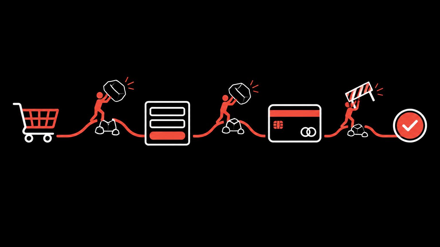
A typical checkout has a few stages: basket, contact details, delivery address, shipping method, payment, order summary and confirmation. Friction can arise at any stage. The following graphic shows the journey and highlights points where questions often arise.
With hosted systems such as Shopify, the checkout is largely predefined and managed centrally in the checkout settings. This has advantages because the process is tried and tested. However, it also means that not every detail can be customised freely. The changes available depend on the platform and plan and must be checked before implementation.
A clear basket and visible total costs
The basket should show at a glance what is being ordered: product image, name, selected variant, quantity and price. Customers should be able to change quantities and remove products. A clear route back to shopping helps if anything is missing.
Unexpected costs are among the most common reasons for abandonment. Show shipping costs as early as possible, ideally on the product page or in the basket. If shipping is free above a certain order value, it helps to show how much more needs to be spent. The article Planning shipping and collection for a Swiss online store explains how to set up sensible shipping rules.
Guest checkout and clear form fields
Not everyone wants to create an account for a single purchase. Guest checkout lowers this barrier. You can offer an account after the order, once the details have already been entered. Most systems let you make accounts optional, compulsory or unavailable.
Every form field should have a clear purpose. Ask only for information needed for delivery and payment. Labels should sit above the field and remain visible while typing. Correctly marked-up fields bring up the appropriate smartphone keyboard, such as a numeric keypad for the postcode. Google covers these details in its payment and address form best practices.
Review your form fields
- Is every field genuinely needed for delivery or payment?
- Are labels clearly visible above the fields?
- Are required fields clearly marked?
- Does the appropriate keyboard appear on smartphones?
- Does browser autofill work?
- Can the delivery address differ from the billing address?
- Is guest checkout available?
Mobile usability and payment methods
Many orders are completed on smartphones. Buttons must be large enough, text easy to read and fields usable without zooming. Test the checkout on a real device, not just in a smaller browser window. Make sure important information, such as the total amount and shipping method, is not hidden inside expandable sections.
The payment methods offered should suit your customers. Availability depends on the store platform and payment provider. Shopify documents the payment methods for Switzerland. More payment methods are not automatically better. What matters is that customers find the methods they expect and that these work reliably. Check fees and terms before implementation.
Error messages and the order summary
A good error message explains what is wrong and how to fix it. It appears beside the relevant field, not just at the top of the page. Information already entered is retained. The W3C guidance on accessible forms explains how to make messages understandable for screen reader users too.
Before submission, the order summary brings everything together: products, variants, quantities, delivery address, shipping method, payment method and total amount. Customers should be able to correct individual details here without starting the whole process again. The submit button must clearly state that it places an order requiring payment.
Shipping information and delivery times
Alongside costs, customers want to know when their order will arrive. A realistic delivery estimate builds more trust than an optimistic promise you cannot keep. If certain products take longer, for example because they are made to order, mention this on the product page and in the basket, not just in the confirmation.
If you offer several shipping methods, distinguish them clearly by price, delivery time and tracking, where applicable. In-store collection is also shown as a shipping method, with the address and opening hours. The less explanation a method needs, the easier it is to choose.
Also review the names of your shipping methods. Internal labels or logistics tariff names mean little to customers. Descriptions such as ‘Standard shipping, two to three working days’ or ‘Collection from our shop in Basel’ are better. The precise details should reflect how you actually operate.
If you would like to know where your checkout creates unnecessary obstacles, ask us to review your online store.
Send a non - binding enquirySmall details with a big impact
Many checkout obstacles are small: a prominently displayed discount field that unsettles people without a code, an incorrect default country or a button that disappears behind the smartphone keyboard. These details often only become apparent when you deliberately work through the process step by step.
Establish a routine: place a test order after every change to payment, shipping or extensions. This reveals errors before customers encounter them. Record these test orders in a short checklist so different people can carry them out consistently.
Comparing two purchase processes
The following example lets you compare a confusing checkout with a clearly structured one. Notice when shipping costs appear, how many fields are required and how error messages are worded. Nothing is ordered or paid for.
Delivery costs are calculated at the final step.
Trust, data protection and order confirmation
People enter personal data and payment information at checkout. Clear information builds trust: who the seller is, how to contact you, how returns work and where to find the terms and conditions. Trust marks or payment provider logos are no substitute for this information.
Data protection includes a clear privacy notice linked from the checkout. The FDPIC publishes guidance on this. You or a qualified professional are responsible for assessing the legal suitability of your wording.
After purchase, a page and an email confirm the order. The confirmation includes an order number, the products ordered, the amount, the delivery address and the next steps. Review this wording regularly, as templates often contain generic phrases that do not match your processes.
Unnecessary steps, measurement and limitations
Every extra step is another opportunity to abandon the purchase. Consider whether newsletter sign-ups, additional offers or surveys really belong in the checkout. They are often better placed on the confirmation page, once the purchase is complete.
To understand where abandonment occurs, you need measurement. Store platforms provide their own reports, such as Shopify Analytics. Additional tools, such as analytics software, are activated only with visitors’ consent. Figures show where something happens, but not why. Customer feedback and your own test purchases provide useful context.
Not every idea can be implemented. Hosted checkouts deliberately limit changes, and some features are tied to particular plans. An honest assessment establishes what is possible within the existing system and what would require more substantial changes.
| Problem | Possible effect | Question to ask | Possible improvement |
|---|---|---|---|
| Shipping costs shown only at the end | Surprise, abandonment | Where do shipping costs first appear? | Show costs in the basket |
| Mandatory account creation | Barrier to first purchases | Is guest checkout available? | Enable guest checkout |
| Long forms | Fatigue on smartphones | Which fields are necessary? | Remove optional fields |
| Unclear error message | Confusion | Does the message explain what to do? | Show a solution beside the field |
| Missing payment method | Unable to purchase | Which methods do customers expect? | Check a suitable method |
| Distractions at checkout | Abandonment before completion | Is this step needed here? | Move it to the confirmation page |
How to approach improvements
Start by making a test purchase yourself, on both a smartphone and a computer. Note every point where you hesitate or have to look for something. Then ask someone unfamiliar with the shop to place an order and observe where they get stuck. This simple exercise often reveals more than any report.
Prioritise the issues you find by how often they occur and how much effort they take to fix. Frequent problems that are easy to resolve come first. Plan larger changes only once you know they are possible within the existing system.
For a structured review, the article Online store analysis: areas to review covers every part of the shop. Improve or rebuild your online store explains whether small corrections will suffice or more substantial changes make sense. Our Online store improvement service covers specific adjustments to an existing shop.
Summary
- Unexpected costs are a common cause of abandonment, so show shipping costs early.
- Guest checkout and short forms lower the barrier to first purchases.
- Error messages should appear beside the field and explain the solution.
- Test the checkout yourself regularly on a real smartphone.
- Measurement with consent shows where; conversations and tests show why.
- Hosted checkouts have limitations that must be checked before planning changes.
Frequently asked questions
Does a better checkout guarantee more sales?
No. A clear checkout removes obstacles, but sales also depend on the product, price, demand and trust. Improvements create better conditions but do not guarantee a result.
Can I design the Shopify checkout freely?
Only to a limited extent. Shopify largely defines the process, with customisation possible within certain limits. Check what your plan allows before implementation.
Should I require a customer account?
Guest checkout is usually more convenient for first purchases. You can offer an account after the order. For business customers who order repeatedly, however, an account may be useful.
How many payment methods does a shop need?
As many as your customers expect, no more. What matters is that the usual methods work reliably. Availability depends on the system and provider.
How can I tell where customers abandon their purchase?
Store platforms provide their own reports; additional tools are activated only with consent. Supplement the figures with your own test purchases and feedback from customer service.
Does the checkout need to be accessible too?
An accessible checkout helps everyone: clear labels, a clearly visible focus indicator and understandable error messages. The W3C guidance on forms provides a good foundation.
Sources
- Shopify CheckoutShopify · checked on 2026 - 11 - 05
- Payment and address form best practicesGoogle web.dev · checked on 2026 - 11 - 05
- Customer payment methods with Shopify Payments in SwitzerlandShopify · checked on 2026 - 11 - 05
- Forms TutorialW3C WAI · checked on 2026 - 11 - 05
- Online privacy noticesEDÖB · checked on 2026 - 11 - 05
- Shopify analyticsShopify · checked on 2026 - 11 - 05
Back to the top of the article