Trends and inspiration · Trends and inspiration
Web design trends: what is useful and what is just an effect?

Web design trends can give a website character and make content easier to understand. But not every eye-catching idea improves usability. What matters is whether the design and technology suit your brand and visitors.
Design begins with a purpose
A web design trend is not automatically an improvement. It is first a design option whose value depends on whether it serves your brand, content and audience's needs. A website should provide direction, support trust and make next steps clear. Only once these foundations are in place is it worth asking which visual approach feels contemporary.
The content of this article was last reviewed by a subject specialist on 5 November 2026. The examples are neither a ranking nor a guarantee of better results. Assess every idea in relation to your offering, existing content and technical circumstances. An effect that suits a campaign page may be disruptive on a substantial business website.
Typography, grids and colour
Large typography can give a page a clear focus. A distinctive heading helps people scan the page if it remains understandable and does not take up excessive space on small screens. Very large type is no substitute for a clear message. Check line length, wrapping and contrast across different views.
A consistent grid organises text, images and modules. It creates familiarity and simplifies maintenance without making every element identical. Asymmetrical layouts can create visual interest, provided the reading order remains clear and important content is not pushed to the edges. On mobile devices, the arrangement needs deliberate reconsideration rather than simply shrinking a desktop composition.
A dark design can suit a brand and provide a calm setting for certain content. It is not automatically easier on the eyes and requires careful checks of contrast, font weights, links and form states. Bold colours create accents but should serve a recognisable purpose. Do not use colour alone to explain error messages or selection states.
Bespoke illustrations communicate relationships or establish a distinctive visual world. They need a clear brief and a consistent system. Decoration unrelated to the content adds work and can distract from the message. What matters is whether the imagery and tone suit your audience.
Microinteractions and scroll animation
Microinteractions are small pieces of feedback, such as a visible focus state, confirmation after submission or an understandable change when making a selection. They help when they clarify the current state. Movement that merely demands attention can distract or feel uncomfortable for some people. Keep duration and extent restrained and provide reduced-motion presentation where appropriate.
Scroll animations can build up an explanation gradually or accompany a story. If content appears only after movement, this can make navigation harder and affect performance. Important information must remain accessible without animation. Test the page on a slow connection, with a keyboard, on touch devices and with reduced motion enabled.
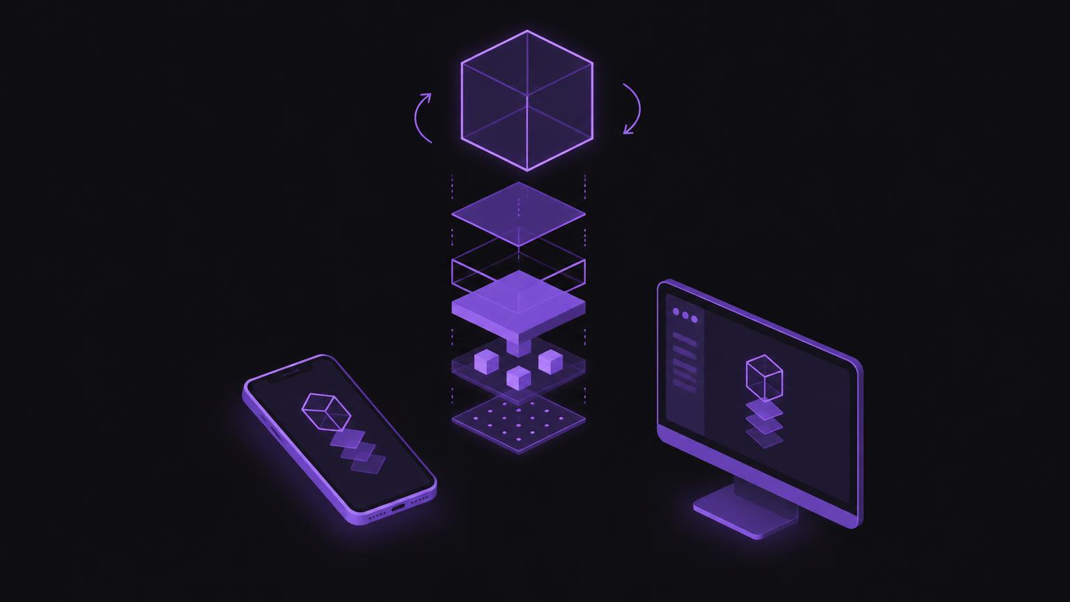
Interactive product displays are useful when shape, construction or variants matter to a purchasing decision or understanding. A rotating view can show details that a single image cannot convey. However, this does not always require a complete three-dimensional scene. Several optimised images or a simple comparison view may suit the task and device better.
Discuss with us which design approach suits your brand and your website's objectives.
Send a non - binding enquiryPerformance, accessibility and mobile use
Every additional font, animation, image file or external embed has technical consequences. Optimise image sizes, load content as needed and avoid unnecessary scripts. A page may look visually minimal yet still be slow if large files load in the background. Measure and test the actual implementation on representative devices; a single lab result does not describe every usage situation.
Accessibility belongs in the design process, not a later round of corrections. Pay attention to meaningful headings, sufficient contrast, visible keyboard focus, understandable links and alternative text for relevant images. Forms need labelled fields and clear guidance. WCAG provides a structured reference framework, but does not replace assessment of the actual website or expert consideration of all usage situations.
Mobile presentation involves more than width. Targets must be reachable with a thumb, content readable and interactions usable without precise mouse movements. Test different screen sizes, portrait and landscape orientations, and longer text. Interactive elements need an equivalent alternative when hovering, dragging or fine gestures are unavailable.
Choose trends with purpose
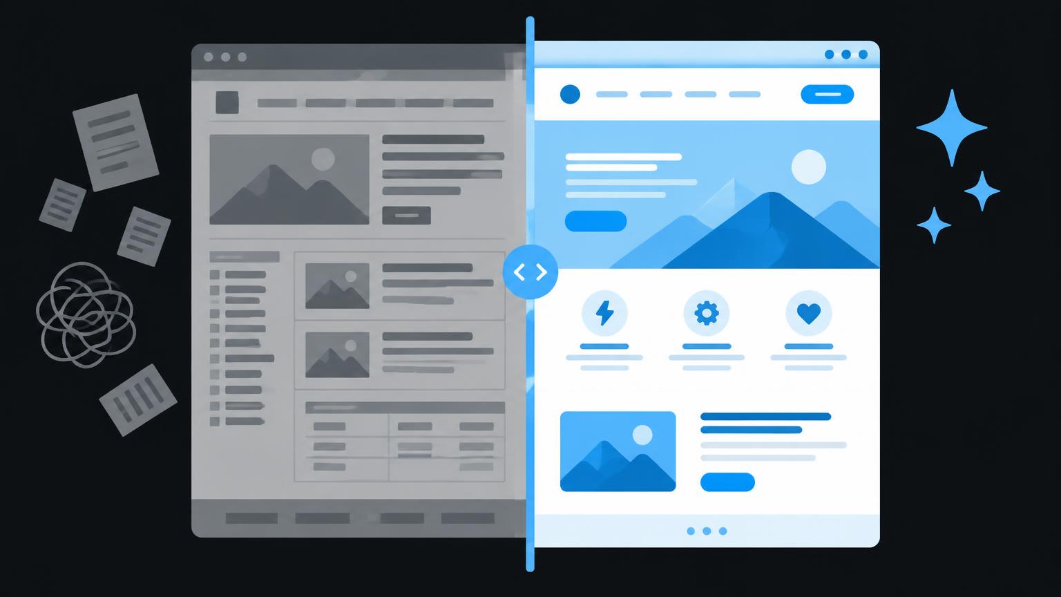
Assess every idea across five areas: brand, content, usability, performance and accessibility. A trend is used meaningfully when it fulfils a recognisable purpose without placing disproportionate demands on the other areas. An idea is project-dependent if it can be assessed only after prototyping and testing. It is mainly decorative if it offers neither informational value nor helpful feedback.
Start with a clear question: what should become easier for visitors? Then establish a simple baseline and compare a restrained version with the desired design. Include real content, not just placeholders. Check whether the idea still works on mobile and remains understandable without movement.
Checklist before implementation
- Does the design suit the brand and audience?
- Does it make important information easier to understand?
- Do navigation and content remain accessible on mobile devices?
- Does the page work with a keyboard and reduced motion?
- Have loading time, image files and technical dependencies been checked?
- Is there a simpler alternative with comparable benefits?
- Has the implementation been tested with real content before publication?
Do not decide solely on personal taste or an example from another market. Discuss objectives, content and technical limitations early. For a structured update, consider website improvement, or plan website creation with a suitable design concept.
From initial design to a dependable result
Good implementation begins with priorities. First define page objectives, content and necessary actions. Only then choose typography, grids, colour and supplementary effects. This keeps the design connected to your offering and makes it easier to develop further.
Create a clickable prototype for areas where behaviour or sequence is unclear. Gather feedback from people who were not involved in planning. Ask not only whether they like the page, but whether they can find information, recognise a difference and understand the next step. Observe specific difficulties and adjust the design.
Also define who will maintain images, text and modules in future. An elaborate effect can become an everyday problem if changes require specialist knowledge. Documented design rules, reusable modules and clear approvals keep quality consistent. Check unresolved technical points before implementation.
Summary
- Trends are tools, not objectives.
- Typography, grids and colour need clear purposes.
- Animations must respect usability and performance.
- Check mobile use and accessibility early.
- Choose design according to your brand, audience and content.
Frequently asked questions
Are web design trends useful for every business?
No. First check whether a trend makes your content easier to understand and suits your brand. A trend is an option, not an obligation.
Can a dark website be accessible?
Yes, but contrast, typography, focus states and controls need checking in all important states.
Are animations bad for loading time?
Not inherently. Large files or scripts can affect performance. Test the actual implementation and provide a suitable reduced-motion presentation.
How do I check a design on a smartphone?
Test real page content on different screen sizes, using touch controls and longer text. Look for readability, reachable targets and a clear sequence.
What does meaningful use mean?
A design element supports a task, remains accessible and suits the technical circumstances. It should remain understandable without the decorative effect.
Sources
- WCAG and other standardsW3C Web Accessibility Initiative · checked on 2026 - 11 - 05
- Web VitalsGoogle · checked on 2026 - 11 - 05
Back to the top of the article