
Guides and tutorials · Guides and tutorials
Planning a contact form: which fields are genuinely useful?
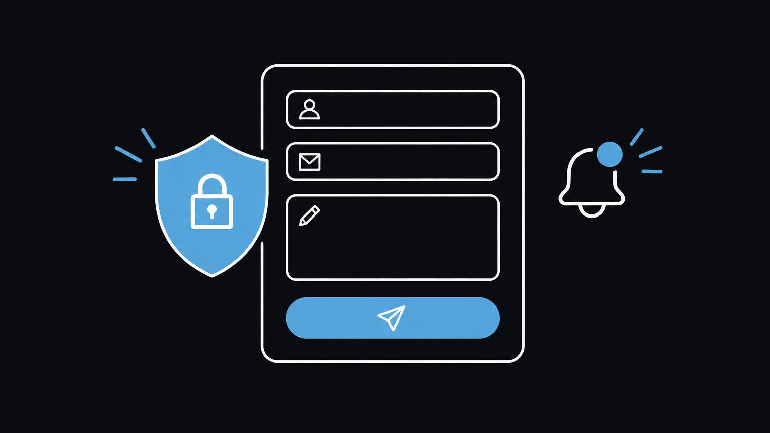
A good contact form makes the first step easy and helps your team assess enquiries correctly. What matters is not the number of fields but their purpose.
This guide takes you from choosing necessary information to testing on mobile devices. A local demo helps you put together a suitable set of fields; it stores and sends nothing.
Define the goal and scope first
A contact form is not an exercise in making a questionnaire as long as possible. It should enable a specific next action and collect exactly the information needed for an initial response. Before building it, establish who handles the enquiry, what response needs preparing and whether a form offers advantages over directly visible contact details. A simple goal usually leads to a clear input process and fewer people abandoning it.
Separate initial contact from later project intake. A short description is often enough for a non-binding enquiry. Details about scope, budget, internal processes or personal circumstances can be discussed specifically later. Do not request sensitive information if it is not necessary for first contact. Less data also means less information to protect and manage internally.
| Field | Possible need | Status | Data protection question |
|---|---|---|---|
| Name | Addressing the person and identifying the enquiry | Required if necessary | Do you need the full name? |
| Replying to the enquiry | Required for an email reply | Will the address be used only for this purpose? | |
| Telephone | A callback is wanted | Optional | Is a call actually necessary? |
| Company | B2B context | Optional | Can the enquiry be handled without this information? |
| Service | Routing the enquiry | Optional or required | Is the selection understandable and sufficient? |
| Free text | Individual explanation | Optional | Do you tell people not to enter sensitive data? |
Choose fields sparingly and make them clear
Name and email are often enough when a written reply is intended. Check whether you genuinely need separate first-name and surname fields. A single name field can make completion easier. The email address field should be labelled as such; an example in a placeholder does not replace a permanently visible label. If you offer telephone replies, make clear that the telephone number is optional or explain when it is needed.
A company field is useful when the enquiry necessarily has a business context. For a mixed customer base, it should not be mandatory without reason. Selecting the desired service helps internal sorting if the options are current, unambiguous and not too numerous. An ‘Other’ option with optional free text can cover missing cases. Present free text as an invitation, not a request to enter confidential information.
File uploads increase work and responsibility. Add them only if a document is essential at first contact. Consider agreeing a suitable transfer method after the initial review instead. Specify allowed file types and size limits only if they have been defined in the actual implementation. Do not invent a technical promise. Also check who can see uploaded files, how long they are needed and when they will be deleted.
Before adding a field, ask which specific decision its answer supports. If nobody uses that information when handling the enquiry, it probably does not belong in the first step. An internal desire for the most complete possible records is not sufficient reason to require visitors to provide extra information. Also check whether the same information is already reliably available elsewhere.
Structure, error messages and interaction
Arrange fields in the order a person can answer them: contact method, enquiry type and a short addition. Explain required fields before submission and mark them consistently. In a multi-step form, each step should have a clear purpose. Show how many steps remain, allow people to return to previous information and prevent entries being lost when moving between steps. For a short enquiry, one clear step is often more appropriate.
Error messages must state specifically what needs correcting. ‘Please enter a valid email address’ is more helpful than ‘Error’. The message belongs near the relevant field and must also be perceivable with assistive technologies. After submission, a clearly visible confirmation should appear. State factually whether the enquiry was sent, and provide an alternative contact method if submission fails. Do not claim a response time that has not been reliably arranged.
Test the form on a narrow smartphone and with magnification. Fields need understandable labels, enough spacing and a suitable on-screen keyboard. Test using only the keyboard: focus must be visible, the order logical and all buttons reachable. HTML validation can check entries early but does not replace clear guidance or server-side validation. MDN explains form validation and its limits.
Protection and internal processes are part of the form
A privacy notice should explain in understandable language which information is collected for which purpose and where further details can be found. A checkbox is not automatically necessary for every enquiry; obtain specialist advice on the appropriate process for your specific purpose. Do not silently combine the enquiry with a newsletter or another use. Request only the consent needed for a clearly identified activity.
Spam protection should reduce abusive submissions without unnecessarily excluding genuine visitors. Check whether your chosen solution integrates external services and what information is processed. Make sure the form is not usable only through difficult-to-read image puzzles. Even simple safeguards must be tested and assessed for their effects on accessibility and data processing.
An internal notification should contain only the information necessary to handle the enquiry. Restrict access to responsible people and use personal accounts with suitable access rights instead of shared passwords. Handover and responsibility must be clear: who checks new enquiries, who covers for them and how is a failure noticed? A well-planned form is of little use if submissions land in an unread mailbox. Business email is a separate service and should not be equated with website creation.
- name · required
- Email · required
- Message · required
Discuss your plans for a website with a suitable contact form.
Send a non - binding enquiryTest the form before use
Start with a simple draft containing the intended fields. Then work through it from the perspective of someone unfamiliar with your offering. Are the purpose and next steps clear? Do they need to understand terminology from your internal project work? A short, clear form is better than a collection of precautionary questions whose answers nobody may use later.
From requirements to a tested form
- Record the purpose
Write down which decision or response the first submission should enable. Remove fields with no direct connection to it.
- Rehearse the process
Submit a test enquiry, check the confirmation and internal notification, and test the process on a mobile device and with a keyboard.
Practical planning checklist
Plan and check your form
Tick items off · local only, not saved
0 of 27 items completed
The journey of an enquiry
A clear representation of the data flow supports planning: a person enters information, the form checks the input, the website sends it to the intended storage location and the responsible team receives a notification. Every transition needs a clear purpose. In particular, check which systems are involved and whether a notification contains more data than necessary.
Make the actual process transparent and align it with the technical implementation. A form may be visible on the website while enquiries are handled through a separate mailbox. Document who approves changes to fields or recipients. This keeps content, technology and responsibility connected rather than allowing them to drift apart after publication.
Summary
- Collect only information necessary for an initial response.
- Make required fields, privacy notices and next steps understandable.
- Test the form, notifications and keyboard interaction before use.
- Clarify internal responsibilities and restrict access.
Frequently asked questions
What information belongs in a simple contact form?
A name, email address and short message are often enough. Request further information only if it is needed for initial handling.
Does a telephone number have to be required?
No, not if an email reply is enough. Make clear whether a callback is available and whether the telephone number remains optional.
Should a contact form allow file uploads?
Only if files are genuinely necessary for the initial enquiry. Clarify access, permitted files and how submitted documents will be handled beforehand.
Is a consent checkbox always needed?
That depends on the specific purpose and process. Do not combine the enquiry with other uses, and have the appropriate notice reviewed by a specialist.
How do I test accessibility?
Use the form without a mouse and check visible focus, logical order, labels and understandable error messages. Also test mobile views.
Sources
- Using HTML form validation and the Constraint Validation API - HTML | MDN MDN · checked on 2026 - 11 - 05
- Sign - in form best practices | web.dev web.dev · checked on 2026 - 11 - 05
Back to the top of the article